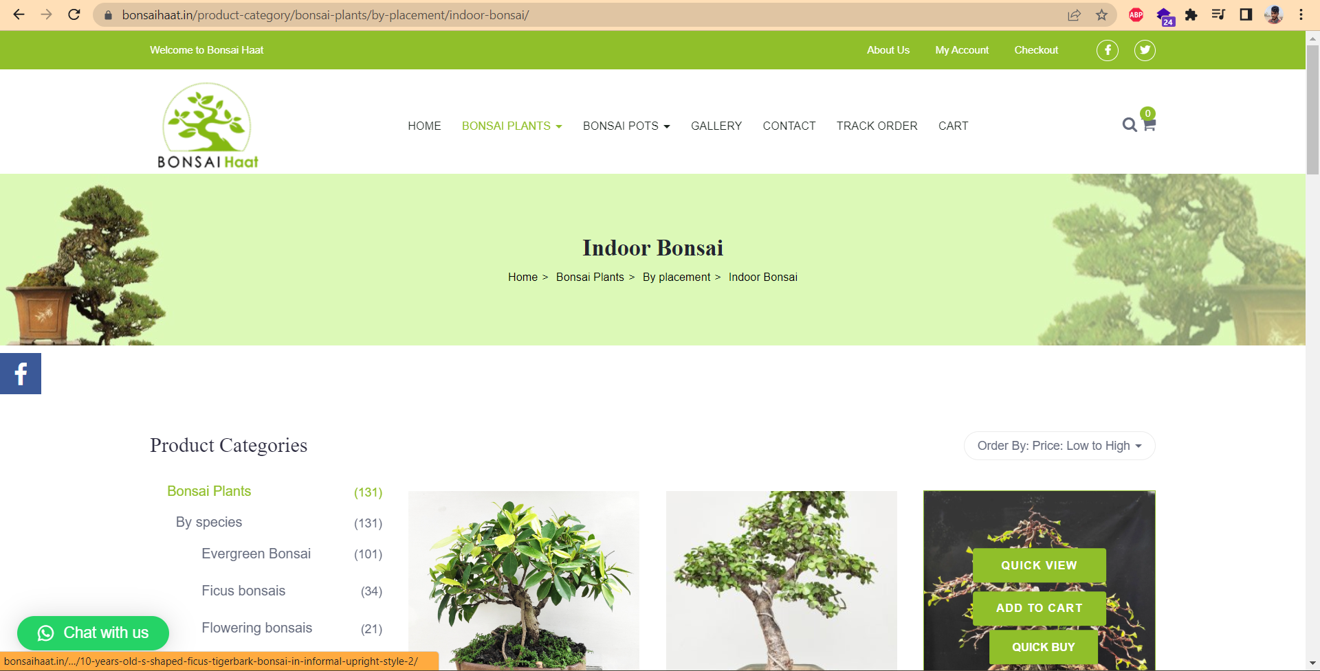
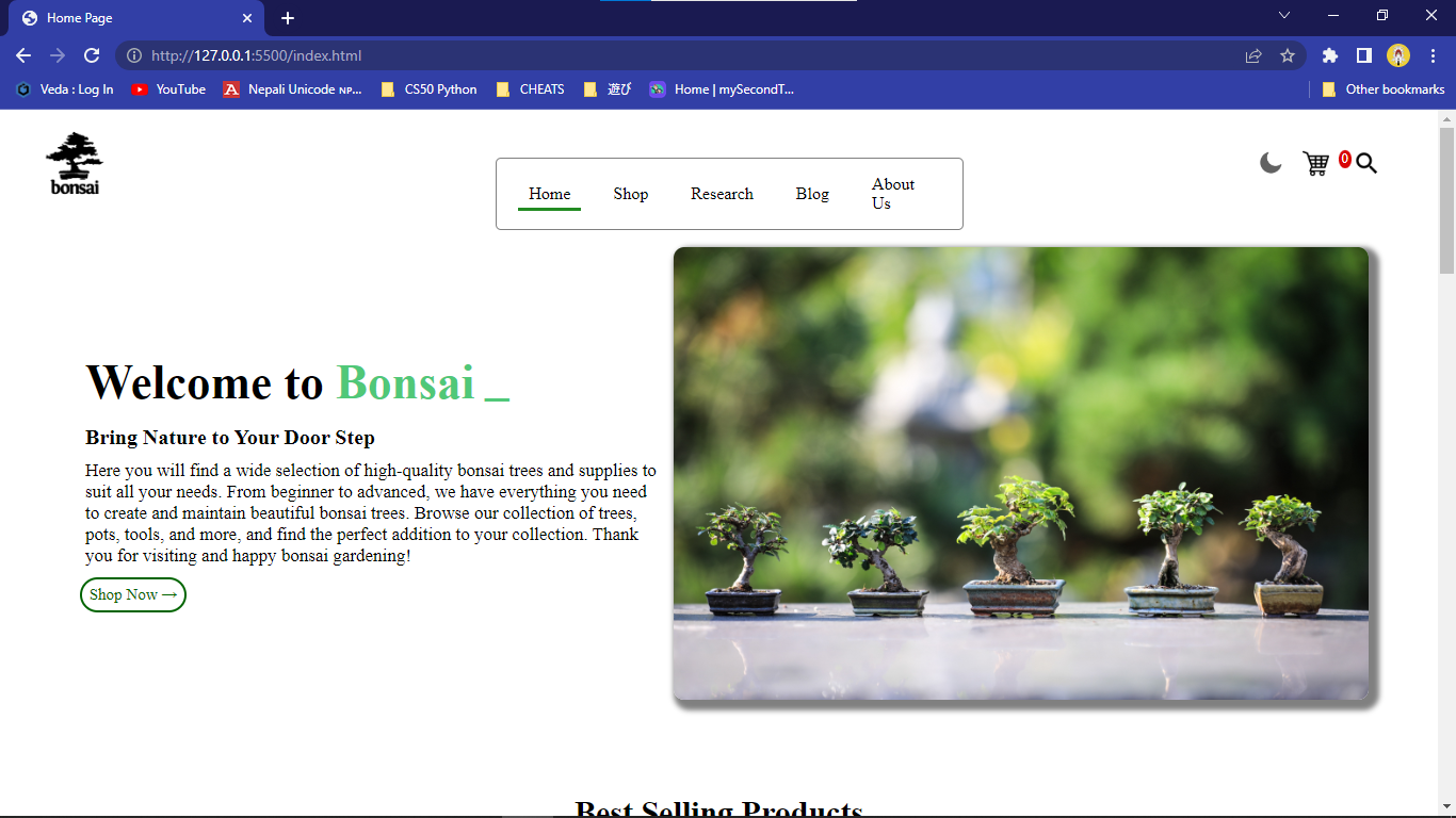
In this section we have taken the idea from bonsaihaat.in on the navigation bar and we changed the hover effects and made it centre justified as it is. We have changed the main home webpage for the hottest product.
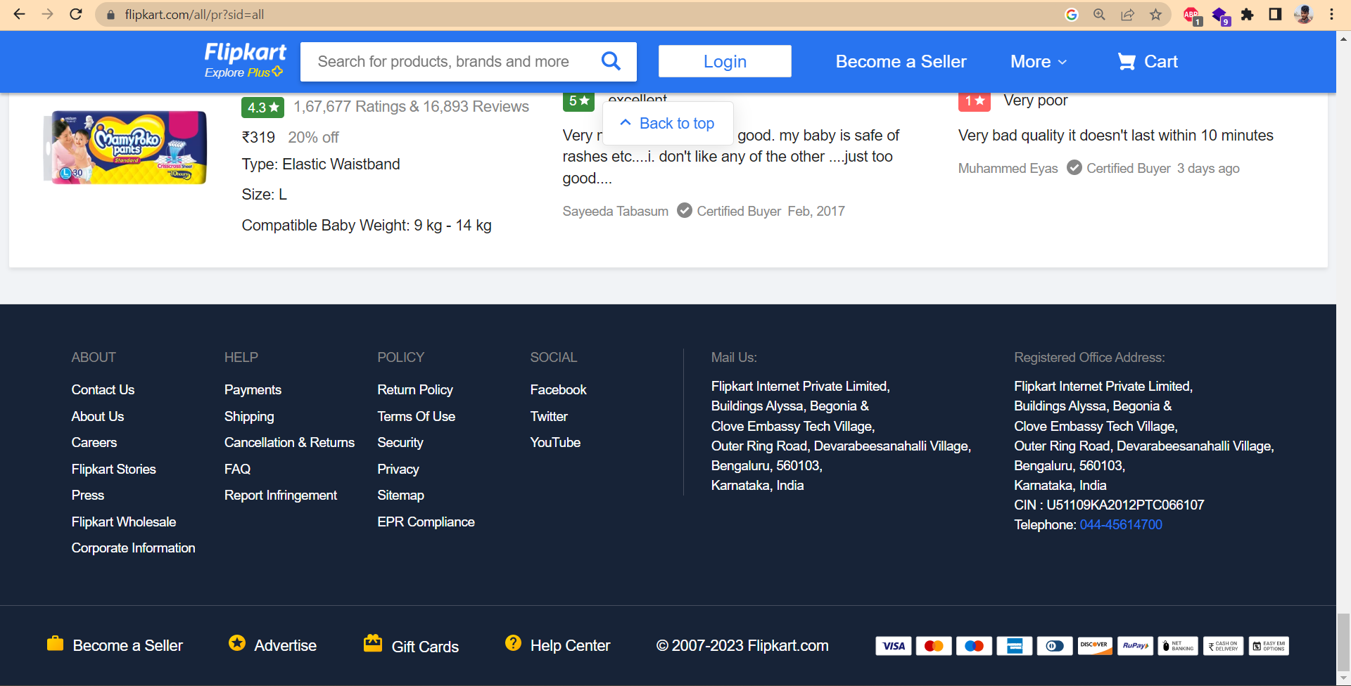
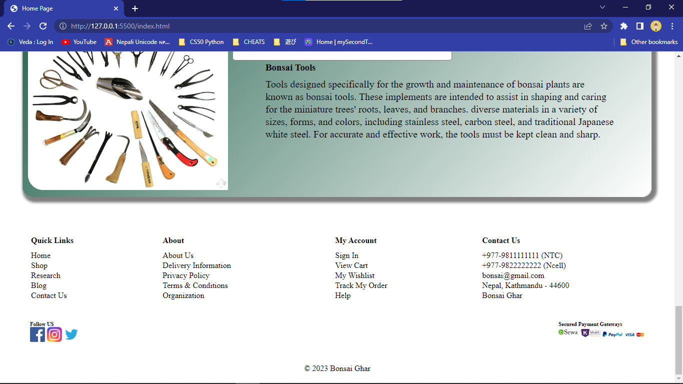
In the footer we have taken idea and concept from flipkart.com and refine with our creativity.
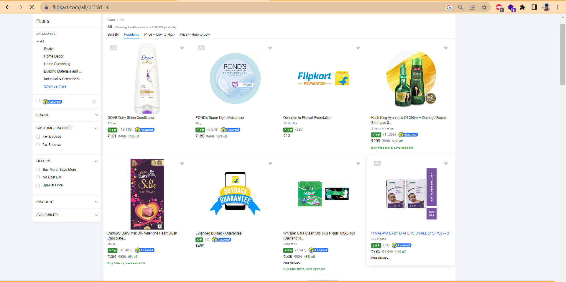
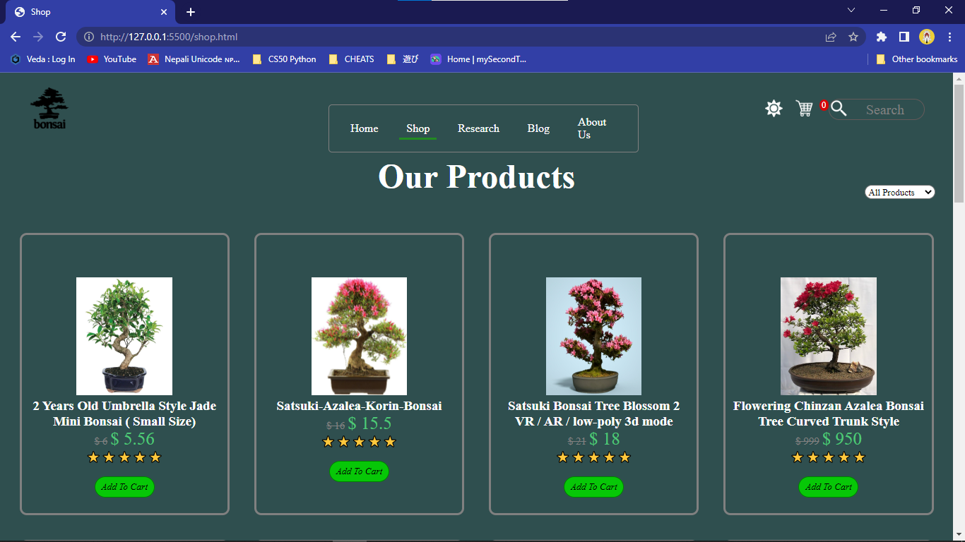
For the shop page we again taken the little concept of flipkart.com. We have used grid for the products item having 4 column at 25% width of each items.